WHICH COLOR SETS THE TONE?
We encounter color everywhere - on products, in rooms, in the city. It makes surfaces visible - but its effect goes deeper. Color organizes and arranges, triggers emotions and conveys messages even before a word is spoken.
Text: Tanja Pabelick


A red traffic light allows us to come to a halt in traffic without much thought. A blue garbage can signals, at least in Germany, that paper belongs here. A yellow box is visible from afar, which is why the German Federal Post Office has been painting its letterboxes in the color traffic yellow since the 1960s. Bicycles, vehicles, branches and employees' work clothes are also painted a striking yellow to match. Over time, the color has established itself as the unmistakable corporate color of Deutsche Post - comparable to the red of the fire department. Color is omnipresent and constantly in use as a silent informant, but is usually perceived unconsciously. Our environment is coded, and we learn the messages behind these codes as children, whether in Germany or elsewhere. In Italy, Poland or Denmark, for example, the post boxes are red, in the Czech Republic they are orange. Through repeated experiences and cultural imprinting, we acquire a knowledge of color that enables us to interpret individual nuances in everyday life at lightning speed and without thinking.
Clearly defined color standards are needed to convey these color messages consistently and reliably. RAL has been contributing to this for a hundred years: The organization has the task of standardizing colors. It is based on the idea of determining individual nuances precisely and reproducibly - both in public spaces and in industry. The name RAL stands for "Reichsausschuss für Lieferbedingungen", and the first standardized colour system was developed back in 1925. The aim was to provide manufacturers, designers and administrations with a binding reference with which they could precisely determine colors and use them consistently. The first RAL-Classic color fan comprised forty shades, which, according to RAL, were intended to "enable economical production, simplify warehousing and goods distribution, facilitate purchasing and prevent wasteful consumption". This later became 216 colors. Their selection is based on clearly defined specifications. A color is only included if it serves an overriding public interest, is timeless and ideally is already associated with a specific area of application. For example, the eggshell shade of light switches comes under electric white, the gold of the German flag under melon yellow, and our passports are Bordeaux violet.
Colour systems such as RAL owe their existence to industrialization, as a result of which manufacturing processes have become increasingly decentralized. In industrialized manufacturing, the individual parts of a product are often produced in different locations, from different materials and by different manufacturers. When a painted metal component from one factory meets a plastic element from another supplier, there must be no color differences - especially not with visible surfaces and joint-free connections. Standardized colour codes such as the RAL system enable consistent product design despite complex supply chains. In the workshop at Studio Kolor in Berlin, the RAL fan is therefore always ready to hand between the measuring tape and material samples.

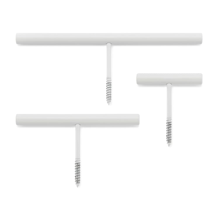
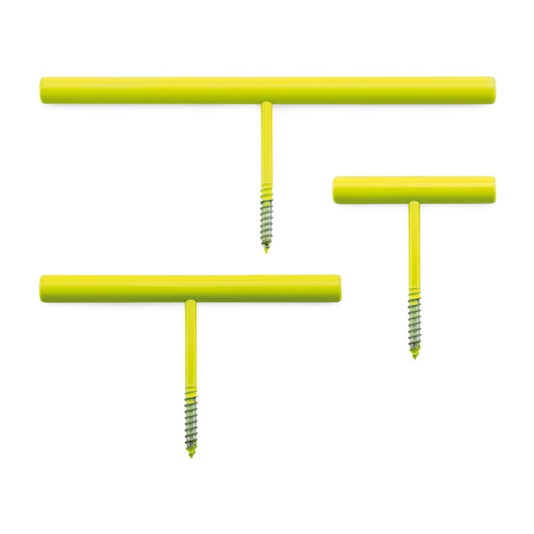
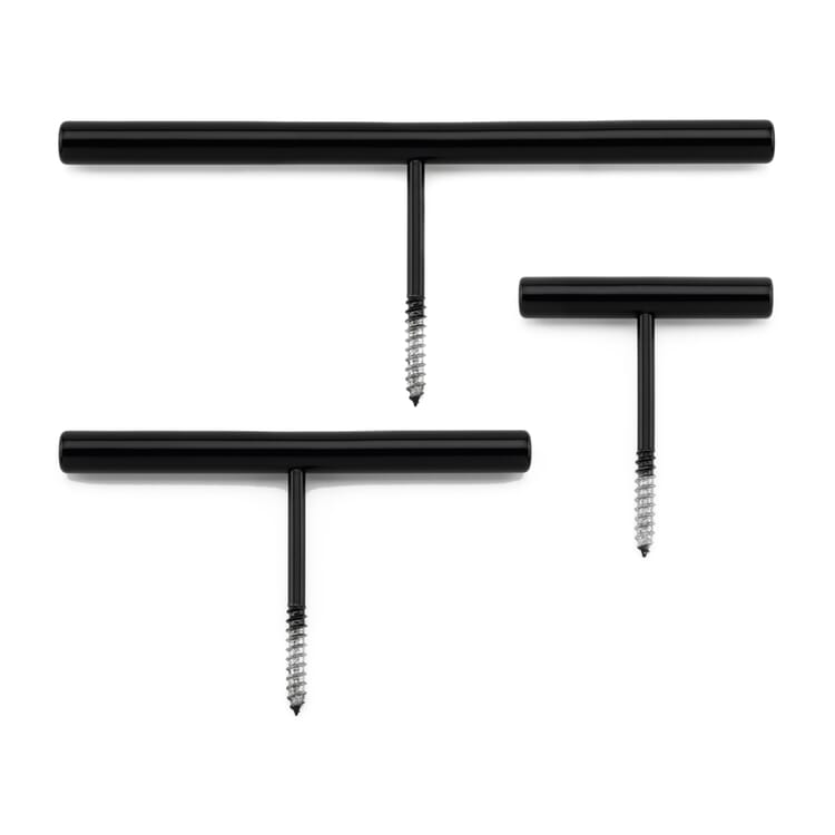
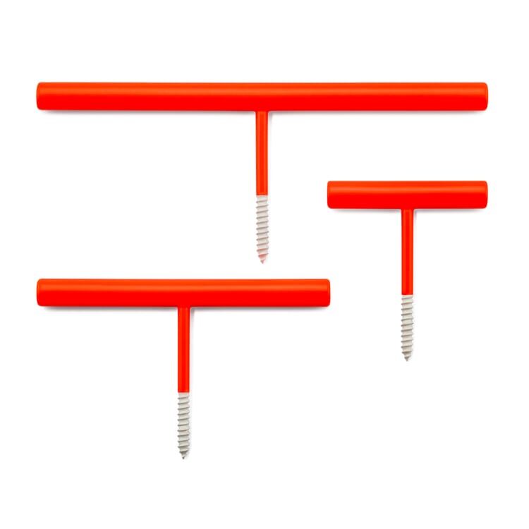
Kolor founders Tatjana Reimann and Uli Meyer have made color a central theme of their collections and design colorful furniture handles, slim metal shelves or formally reduced coat hooks. Most of their products are made of metal and are powder-coated. "When we visit our producers, we always have color charts with us - sometimes to find out together what is not technically possible." Studio Kolor likes to use bright colors, and neon shades in particular are a challenge when powder coating. "Fluorescent pigments are not so temperature-stable. In powder coating, objects are baked in the oven at around 160 to 200 degrees. It must always be taken into account that pigments fade during this process and lose some of their luminosity," reports Studio Kolor.


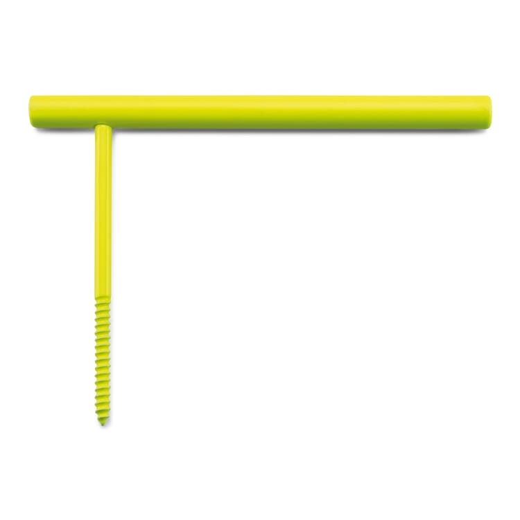
Tatjana Reimann and Uli Meyer have recently observed a comeback of bold and bright colors in design. Particularly popular are colored handle strips, which provide small contrasts on kitchen furniture or sideboards, for example, as well as wall hooks that float above the wall like lines. "Functional objects can be brought out of their shadowy existence through color and take on a role in the interior. For example, if I choose a coat hook or toilet roll holder in signal red and give it a design-reduced silhouette, it suddenly takes on graphic qualities. Color also has the power of a stage direction, it is functional information. A red handle strip on a neutral cupboard immediately signals: you can pull here," explains Reimann. Color is also a cultural issue. A north-south difference can be seen on Kolor's order lists: "The Scandinavians, whose Scandi design tends to rely on light and natural colors, also tend to want gray and white from us. It gets colorful from Benelux to Southern Europe."
Products from Studio Kolor


The regional differences in colour preferences arise from a complex interplay of culture, climate, light, history and socialization. Blue is the most popular color worldwide, but there is a dispute over second place. The UK, for example, prefers red, while in China, Thailand and the USA, green is perceived as particularly pleasant. There is relative consensus on the last places. Brown is consistently unpopular, closely followed by orange. The latter stands for happiness in Buddhism and is therefore perceived more positively in Asia due to its symbolism. What is perceived as loud or inappropriate in one region may be considered lively or tasteful elsewhere due to cultural influences. In Japan, there was long no linguistic difference between blue and green - both were referred to with the word "ao". This peculiarity continues to this day: traffic lights in Tokyo switch to "blue", although the color is clearly green according to European understanding. The term "ao" not only describes a color, but also symbolizes natural qualities such as depth, coolness, vastness or freshness - qualities that are associated with the sky, sea or forest. This close cultural connection to nature also explains why blue and green are among the most popular colors in global color statistics: They appeal to deeply rooted human needs for orientation, security and relaxation.
With its psychological power, color is an effective emotional amplifier in architecture and interior design. Le Corbusier already recognized this. "Color is one of the fundamental components of architecture. It is the soul of a building, its melody," the pioneer of modern architecture once said. He always thought of his designs in terms of color as an equal element alongside floor plan and section and developed a color scale and keyboard with "Polychromie Architecturale". He sorted the 63 room colors contained therein not only according to brightness or relationship, but also according to mood. When choosing the nuances, he was inspired by nature, for example by "the sky reflected in the water", the "freshness of the forest" or "natural sand". Color is an effective means of mastering spatial challenges and creating specific room moods. If a room is too dark, warm yellow and ochre tones can compensate for the lack of daylight. Small rooms appear larger with light and cool colors. Turquoise and light blue tones in particular are reminiscent of the sky and sea, creating a feeling of openness and space. Color is more than just decoration - it acts as a mood enhancer.
Colors also reflect the collective emotional state at certain times. In the post-war years, people were thrown back to the existential. At that time, muted shades such as dark greens, browns and blues dominated, reflecting the uncertain conditions. The economic miracle was accompanied by progress and growth, and a zest for life and optimism about the future were expressed in cheerful colors such as mint green, sky blue, peach and sunny yellow. Growing prosperity created room for individual taste and more diverse products - colorfulness became a sign of prosperity. In the 1980s, on the other hand, bold and provocative colors and wild pattern collages were an expression of a style protest. The Memphis group, led by Italian designers Ettore Sottsass, Michele De Lucchi and Alessandro Mendini, consciously opposed the model of good modern design that had set the tone until then. They rebelled against the conventions of good taste, celebrating eclecticism and a provocative aesthetic. Neon colors, primary colors and daring contrasts caused veritable color explosions in the interiors of this period.

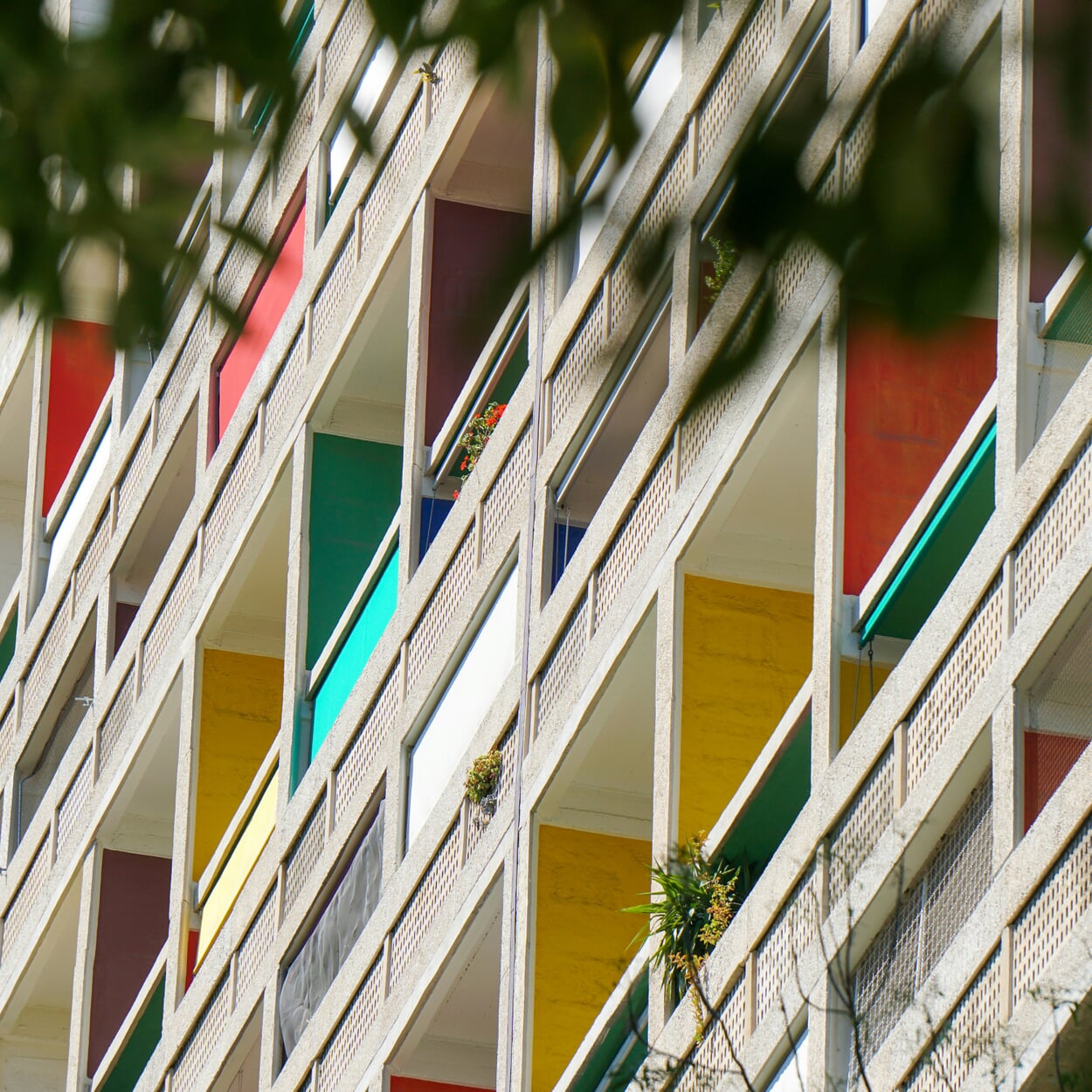
"Color is the soul of a building," said the architect Le Corbusier. The loggias of his Unité high-rise in Marseille glow in different tones


With the growing prosperity of the economic miracle years, things became colorful: page from the Neckermann catalog from 1959

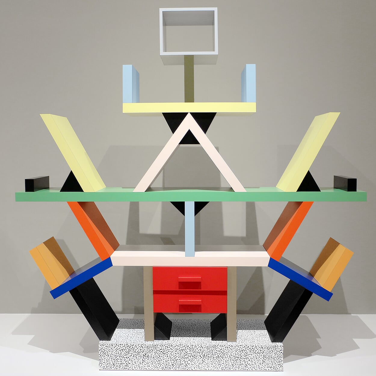
Good form? The "Carlton" bookcase, designed in 1981 by Memphis co-founder Ettore Sottsass
And today? In the breathless pace of social media, color trends seem to change faster than you can repaint a wall. It started with the dusty, pale pink of "millennial pink", which made a career for itself a few years ago. It was later replaced by the hype surrounding the Barbie film and the "Barbiecore" aesthetic with a strong pink as the leading color. Warm, creamy shades of beige came under "Vanilla Girl" - a comforting, escapist world of color that was immediately satirized with the term "Sad Beige". "Matcha Girl" logically stands for warm, earthy green tones, while "Dopamine Decor" refers to brightly colored rooms in which every element seems to have its own color.
Currently, the channels are full of clothing and Objekten in a soft, light shade of yellow called "Butter Yellow" - after butter has already celebrated a comeback on menus in recent years - often whipped up into fluffy mountains. The change in fashions is fueled by companies such as Pantone, who want to boost their business with color systems and advice by proclaiming new trend colors every year. In 2025, a warm, soft brown called "Mocha Mousse" will set the tone and, according to Pantone, stand for "a global mood of connectedness, security and harmony". A diagnosis of the times that a glance at the news app is unlikely to confirm. And if you're looking for long-lasting solutions in design and furnishing that won't look outdated after two or three years, supposedly trendy colors can't be a benchmark anyway. What already leads to hopeless overconsumption in fashion becomes completely absurd when it comes to living: how often should you buy a new sofa? Swiss Post can serve as a role model here: Even though it may have transformed itself from a state-owned company into an international logistics provider and closed all its post offices, its letterboxes are still yellow.
Images: Raw Color, Studio Kolor, Pablo Saborido, billow926 / Unsplash, Louis Charron / Unsplash, Archive Wirtschaftswundermuseum, Sailko / Wiki Commons
NOW IT'S GETTING COLORFUL
Up the rainbow and back down again: Colors provide orientation in everyday life, make classics look contemporary and maximize design potential. From work lamps to bath towels, here are six examples from the MAGAZIN range that show how colors enrich our everyday lives.
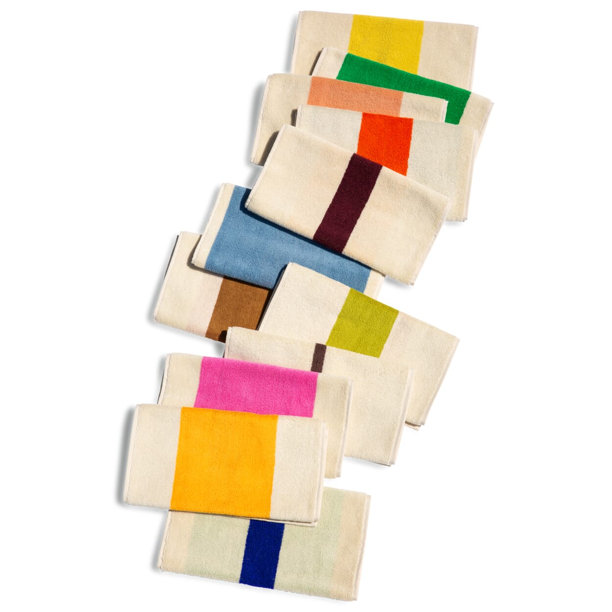
Beach huts in Le Havre as a model for a towel collection? Graphic designer Karel Martens developed a pattern of stripes to paint the white huts to celebrate the city's 500th anniversary. The pattern, calculated using an algorithm, is based on ten colors and six different stripe widths - the company Suite702 worked with Martens to scale it down to the size of beach and bath towels.
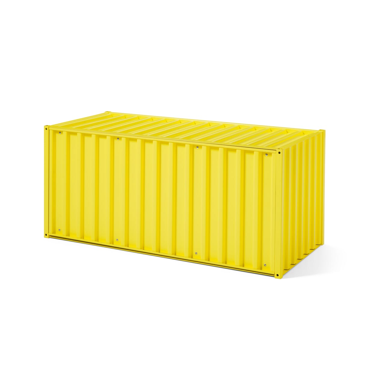
Twelve colors, even more possibilities: Thanks to its modular character, our storage space classicCONTAINER DS can already be configured into a wide variety of furniture - from a bench to a sideboard to a wall unit. But the twelve shades of the CONTAINER DS range, from pebble gray to sulphur yellow, multiply the design options even further. Whether in plain colors or with maximum contrasts: personal taste is the deciding factor.
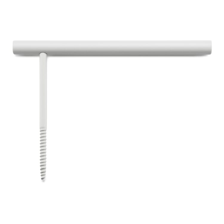
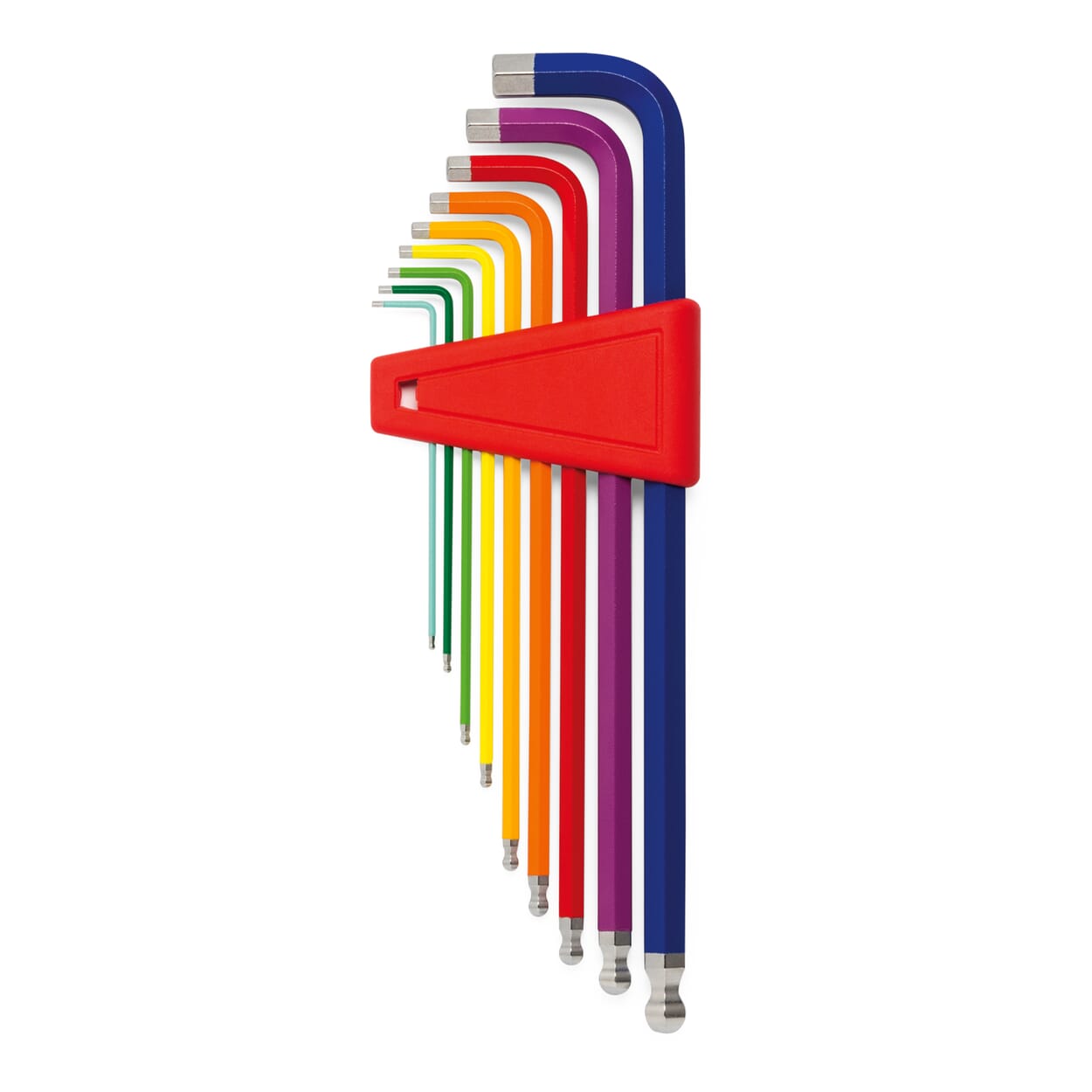
Colors guide us through everyday life, from the red stop sign to the green emergency exit sign. This Swiss tool set with nine Allen keys works on the same principle. It is called "Rainbow" because all the colors of the rainbow help with orientation in the toolbox: from dark blue for the 10-millimeter key to light blue for the one-millimeter key. Plus: the utensils are clearly visible.
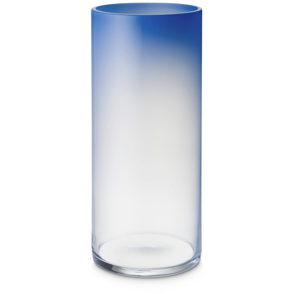
Color without light is already physically unthinkable, but with these hand-blown glass vases, the duet takes on new qualities. Because when light shines through translucent, tinted materials, colors become particularly beautiful and vibrant. The effect is further enhanced in the mass-colored vases by the irregular gradient from opaque to transparent, from colored to clear.
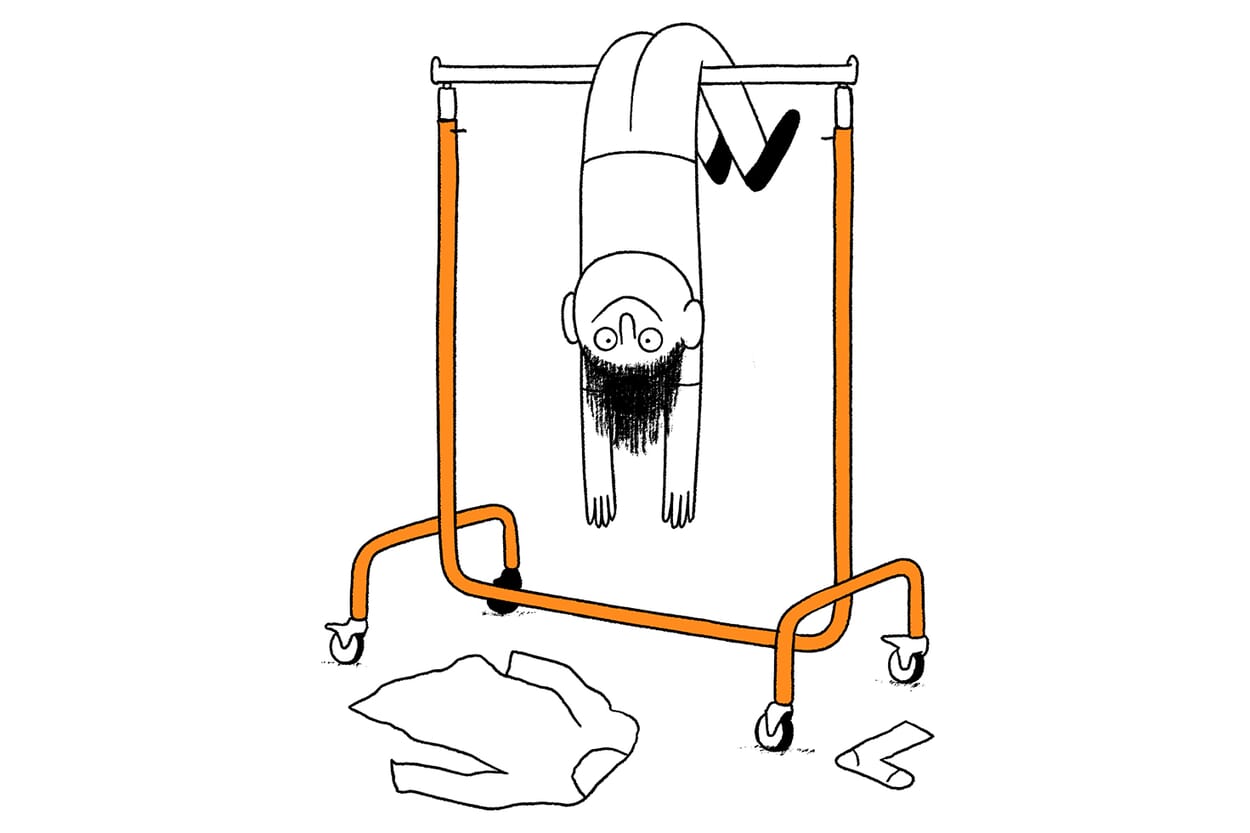
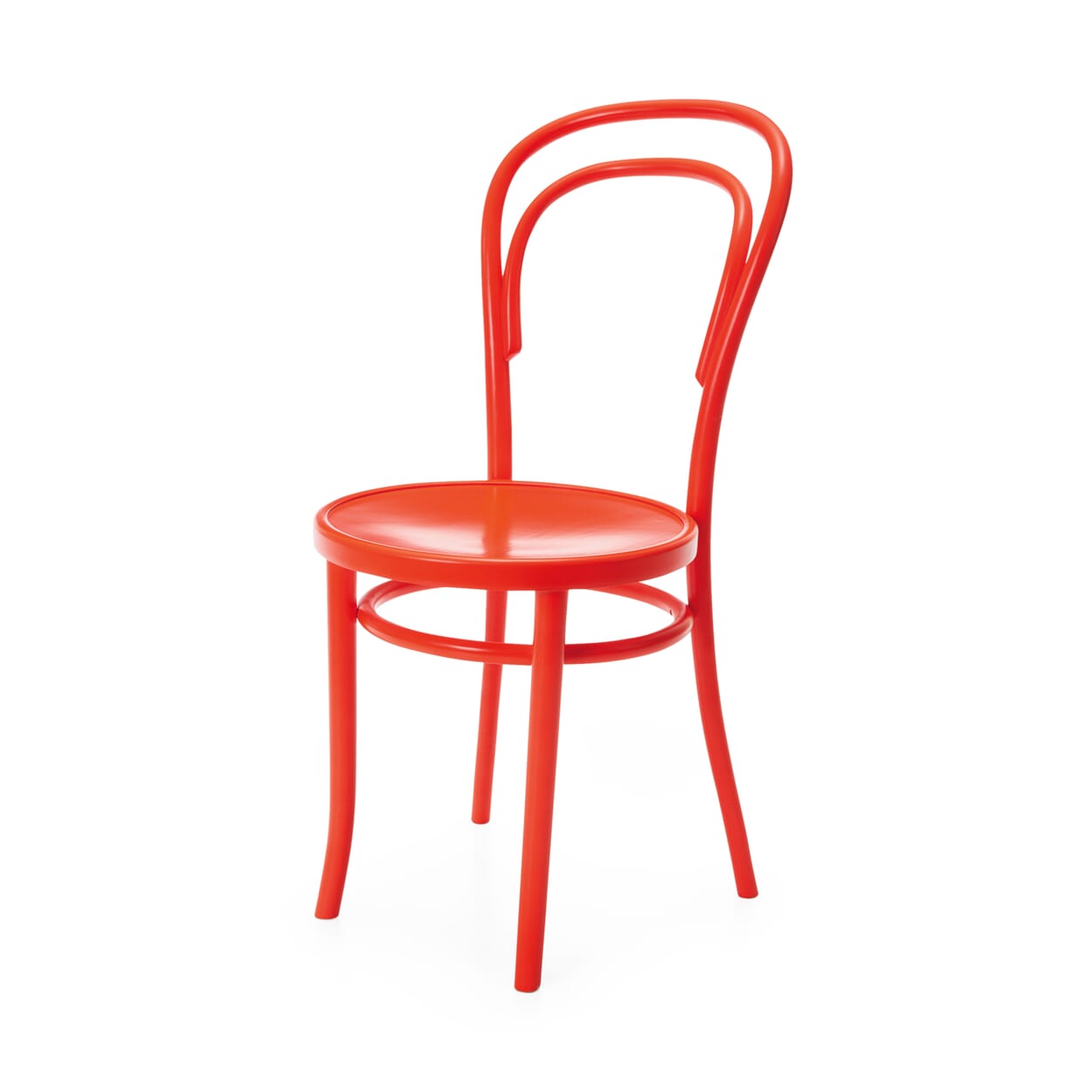
Color can perform small miracles. For example, what happens to coffee house chair no. 14, which has been manufactured for over 160 years and is used all over the world, if you simply dip it completely in the shade RAL 3026 bright red? The classic of all furniture classics suddenly looks completely fresh and contemporary in its bright total look. What's more, the color goes perfectly with the black or wood-colored chairs at the table.


More about color
Bright red is only available from us: MAGAZIN regularly launches well-known and tried-and-tested products in exclusive special editions. Because whether it's a coat rack, chair or pillbox, good design can sometimes be special.
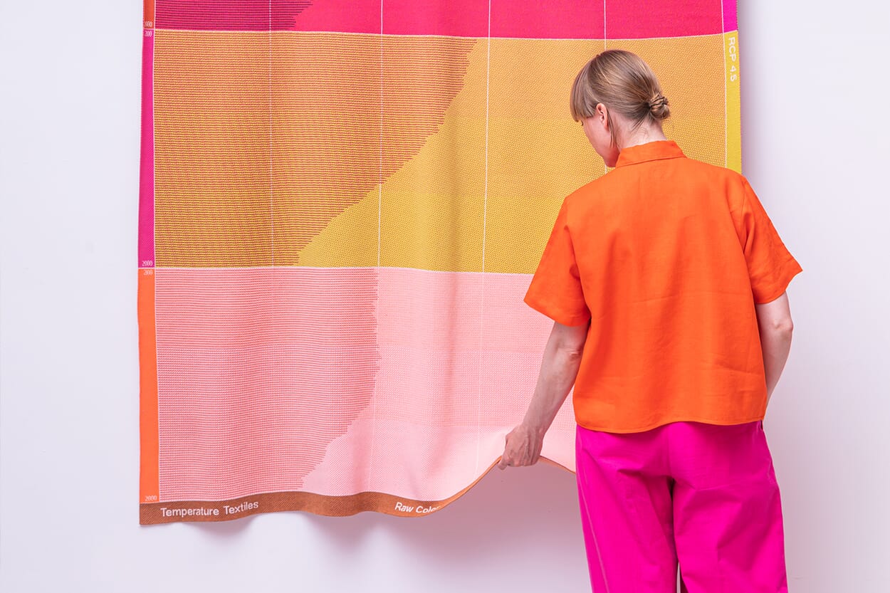
Raw Color has color in its name - and a love of honest and good materials in its heart. The Eindhoven-based design duo Daniera ter Haar and Christoph Brach work across the boundaries of creative professions and combine graphic, exhibition and product design with color as a design element.
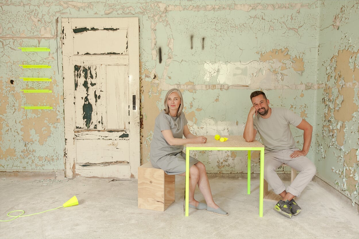
When textile factories dye yarns, they often produce more than they need - just in case. This results in so-called overproduction, yarns that are not needed after all. But what to do with it? Dutch designer Foekje Fleur has an idea.