One element, endless possibilities
1HOCH3 is a shelving unit that is reduced to its essence - and at the same time can grow beyond itself. To mark the 20th anniversary of the MAGAZIN shelving system, we visited designer Dominik Lutz to hear the story behind the design.
Text: Jochen Overbeck
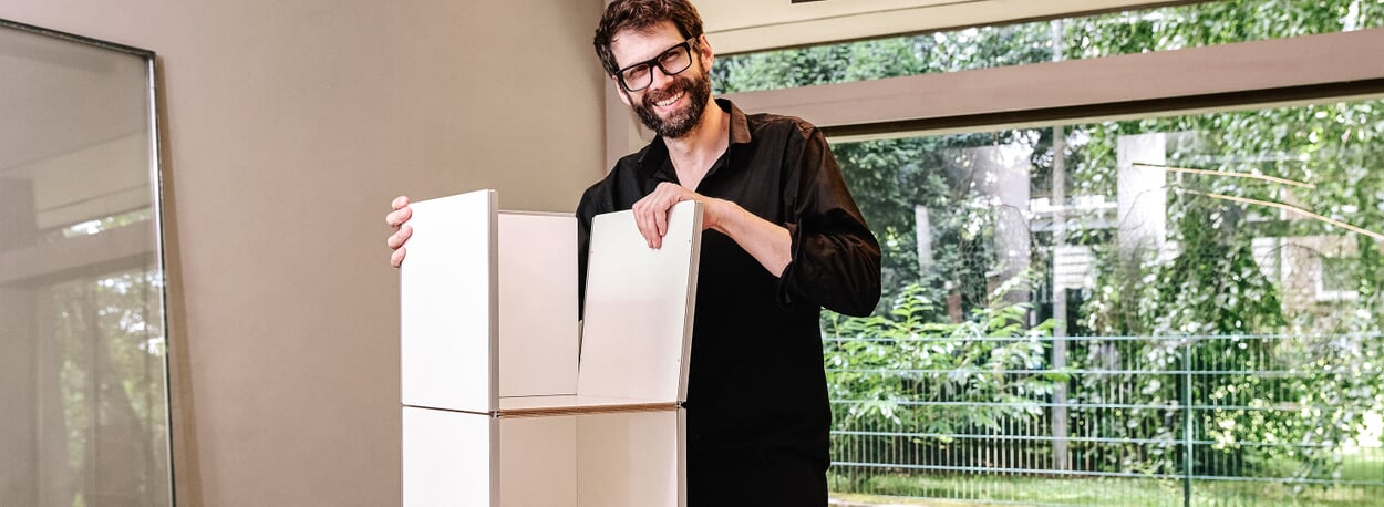
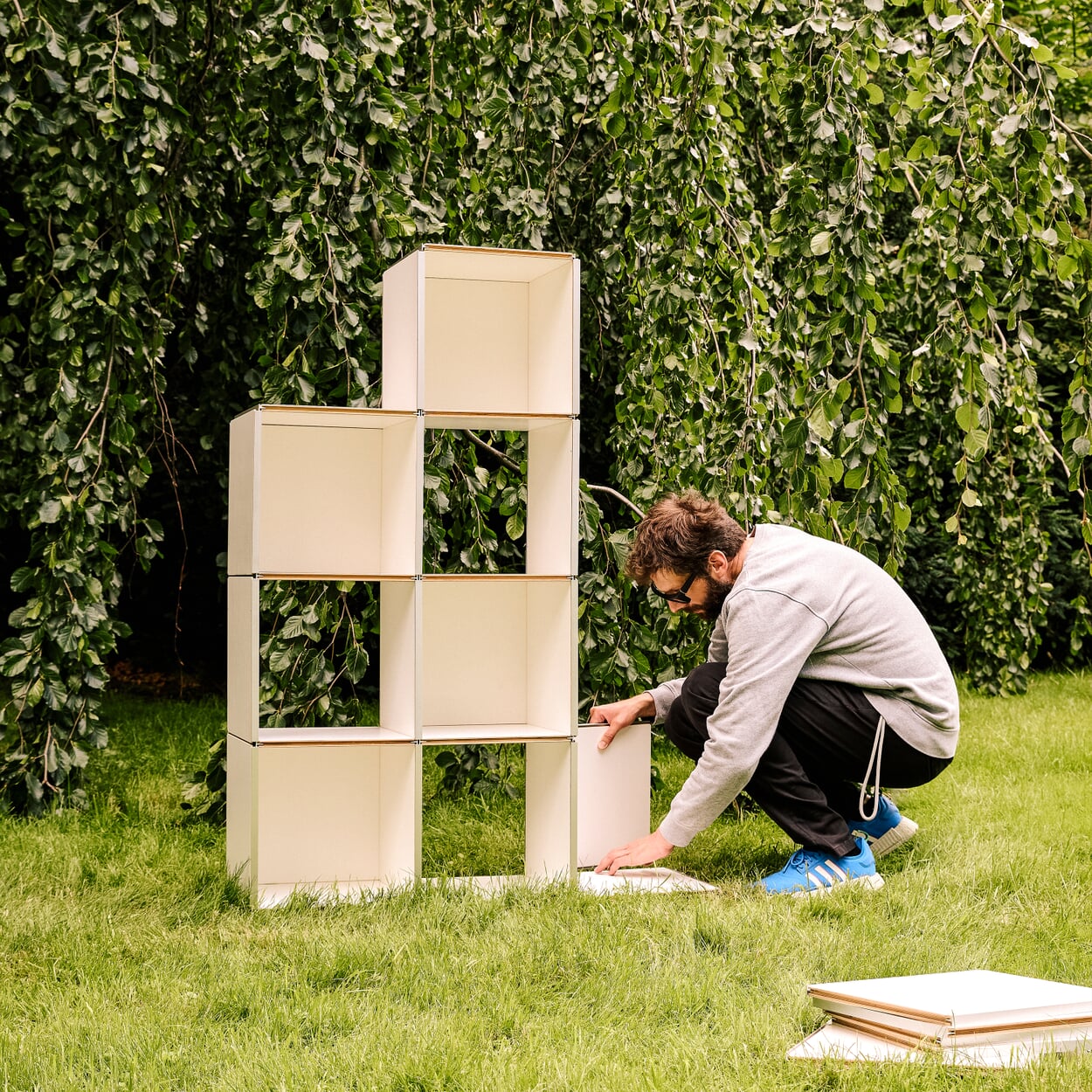
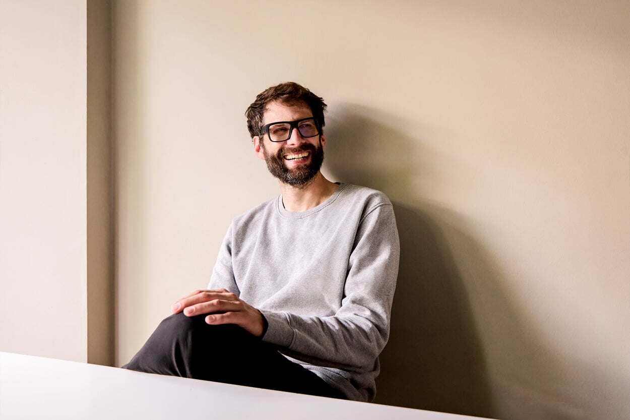
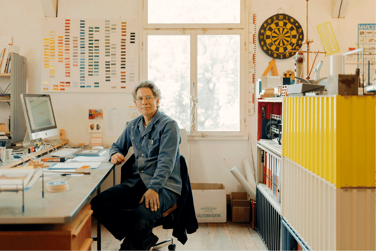
Dominik Lutz is sitting at the white conference table in his studio in Hamburg. The designer - tall, alert, black architect's glasses - has prepared something. The panels, neatly lined up on the table in front of him, provide an insight into the evolution of 1HOCH3. The first prototypes still look very simple, almost clumsy. Wide MDF boards, if you want to join them together, you need a lot of force. But the second version is already clearly recognizable as the ancestor of the shelf. The connection details are still different, and the corners of the panels are not yet rounded, but the idea is immediately recognizable: 1HOCH3 is a shelving system that can be extended not only sideways and upwards. Thanks to the plug-in system, it can also be extended into the third dimension, into the room.
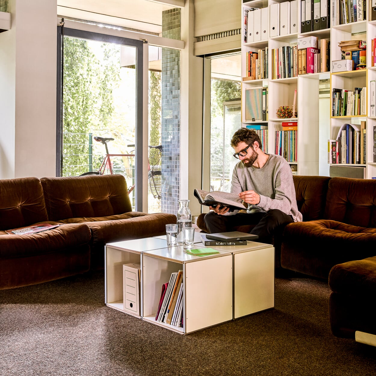
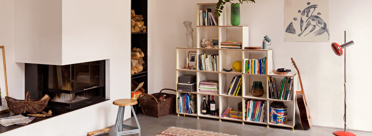
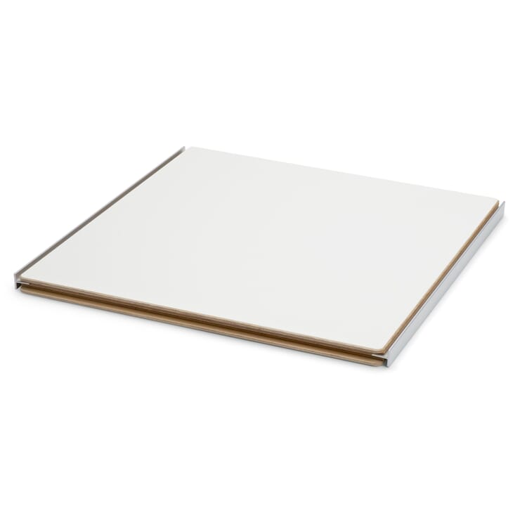
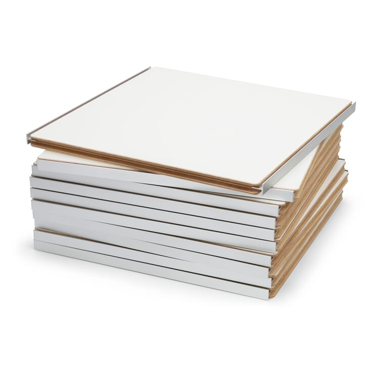
If buyers want it to, this shelf grows beyond itself, shelf by shelf, compartment by compartment. Nevertheless, it takes a back seat in its expression, willingly leaving the stage to the things it stores or presents - and has been doing so for 20 years. It uses a very simple, flexible system: 1HOCH3 is basically a single plywood board with two aluminum profiles. Thanks to these, it can be assembled and disassembled in numerous variants in a short space of time without tools. Only one back panel is required per row of shelves. And that's it. When Dominik Lutz pushes and pushes and taps in his studio and explains how long it took to turn the loose idea of a tongue and groove connection into the finished product, you quickly realize that simple things can be quite complicated. And you realize another thing; one that is often forgotten. A designer doesn't just make sure that an object has a beautiful shape.
But let's start at the beginning: as is so often the case, the designer's path to the product was one that involved a few detours. But these are known to increase local knowledge. For Dominik Lutz, it all began with a fixed idea. Namely that of a shelf consisting of a single element. "I was interested at the time: How can I completely withdraw as a designer? How can I instead organize a single part in the room in such a way that an expandable structure is created?" So the basic idea was clear. But how to turn it into a manageable product remained an open question. The inspiration came during a sleepless night in a hammock on the Andaman Islands. How should the panel element be designed so that the same component with grooves and tongues could also be used as a back panel? And at the same time ensure the necessary diagonal rigidity of the shelving. An older shelving design, in which the shelf and side panel already consisted of the same components, had put Lutz on the right track. In his mind, the problem was solved. But the agonizing limbo as to whether this solution would really work remained until the end of the trip.
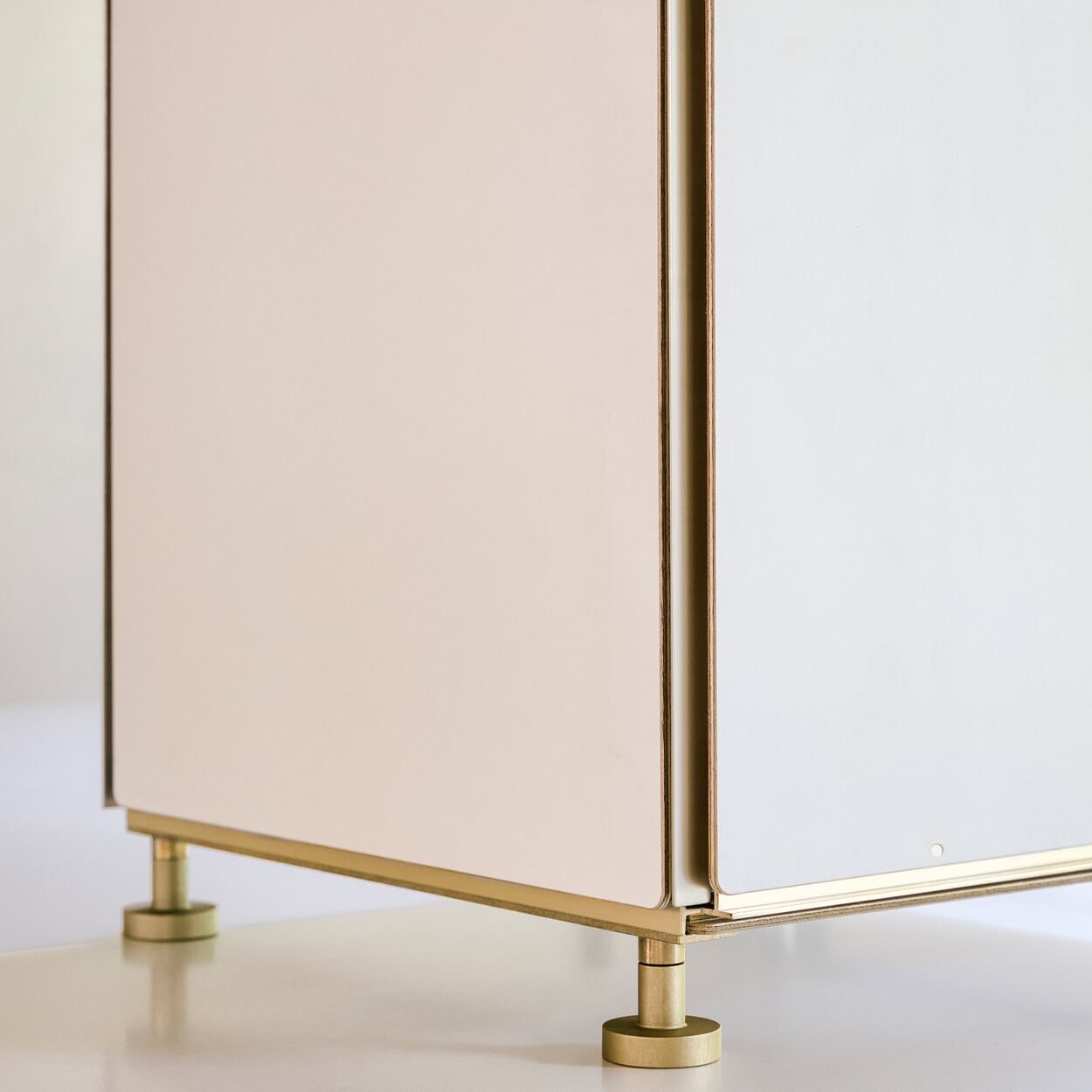
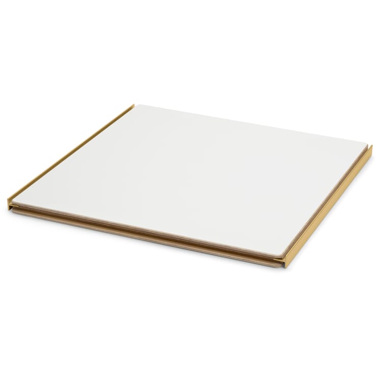
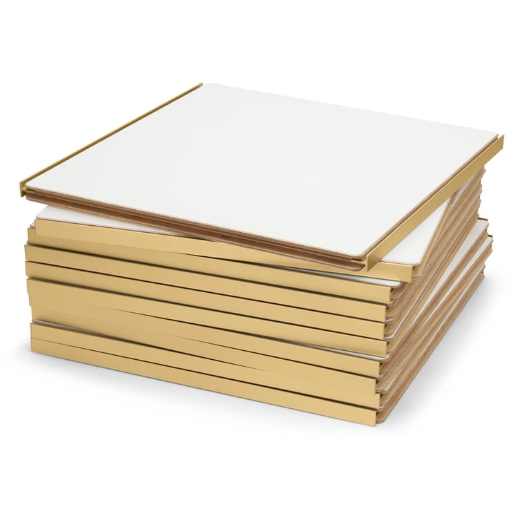
It was not until he got home to his office that Dominik Lutz was able to check his idea on the computer - and it worked. In the end, everything was very simple. A panel component with two standard aluminum T-profiles. The panel milled and slotted. The aluminum T-profiles inserted. Done. At MAGAZIN, they were enthusiastic about this design approach - and still are today: 1HOCH3 has been a perennial favorite in the range of self-developed products for 20 years. Looking back, Dominik Lutz summarizes: "It was very fortunate that we came together 20 years ago. For a product to be successful, a lot has to fit in the end. The design. The right manufacturer and the right time." Over the course of time, the shelving unit has undergone a number of enhancements. No fundamental changes to the system, rather footnotes that turn a radical piece of furniture into one that is both radical and practical. For example, the shelf was given feet that Dominik Lutz had not actually intended. However, they are essential for old apartments with beamed ceilings and uneven floors. Another example of how the devil is sometimes in the detail: the feet have to fit just as precisely at the edge of the shelf as in the middle. "The classic corner problem from the Greek temple. The outer columns are also indented a little," says Lutz. For some years now, the range has also included a shelf that is twice as long, offering customers even more design options. Another addition is a gift for a 20th birthday. But even here, the shelf remains understated: Instead of an additional color, only the profiles of the "Gold Edition" shine in a subtle gold.
Incidentally, the path to the shelving unit that can be found in the range today was not without its obstacles. After all, with a seemingly simple design principle like that of 1HOCH3, everything has to be just right. And it sometimes takes a little longer to get everything right. In the first drafts, for example, the aluminum profiles were screwed to the wooden panels. By the time the product went on sale, however, the decision had been made to glue the shelf and profile together - it looks much nicer! However, the durability left a lot to be desired - even though the load-bearing capacity had been tested with due care! "In my memory, the first picture I received of a broken 1HOCH3 was of a fine vase," says Dominik Lutz and laughs. The cause of the problem quickly became clear: the gluing of the board and profile had not been carried out correctly. In the end, the decision was made to join the two components with bolts - a lesson in product development on a living object. To seriously damage the shelving system today, you would have to use brute force. "If a board falls over or tilts during the assembly of the shelving, it can't be broken!" says Lutz. The color was also reworked: the original brown was replaced with white melamine. And, not unimportantly, FSC-certified wood is now used, i.e. wood from responsibly managed forests.
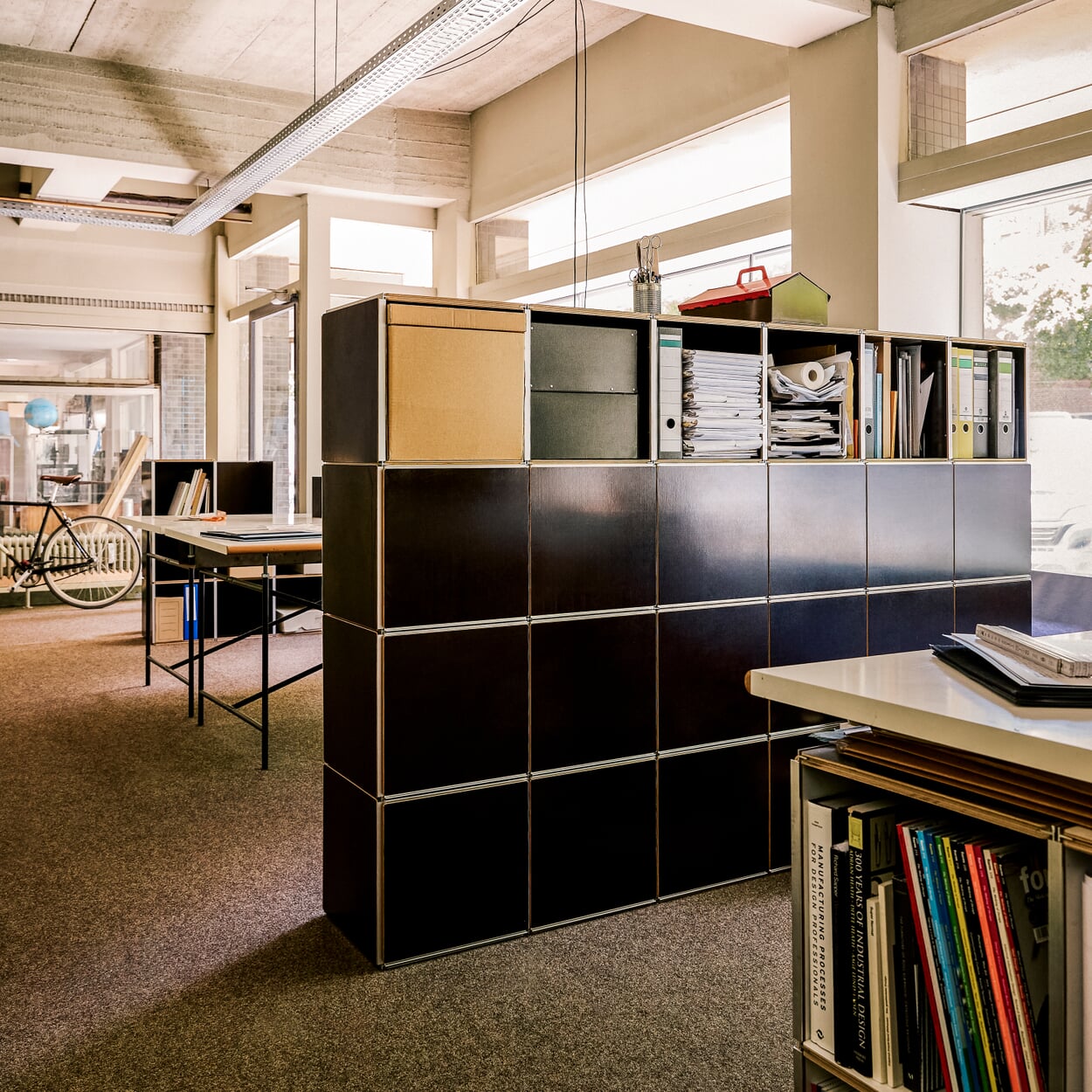
As I said: 1HOCH3 can outgrow itself. Then there are further possibilities with a structure that doubles in depth. A tour of its designer's office shows what this looks like: here it becomes a side table and room divider, offering space for books and small items in both directions. It also serves as an impromptu work counter: Put down your coffee cup, lean against it. Have a quick chat, dive back in and continue working. And so 1HOCH3 is a tried and tested product that is not only found in numerous private homes and in the studio of its inventor. Design offices and publishing houses have also equipped themselves completely with the system.
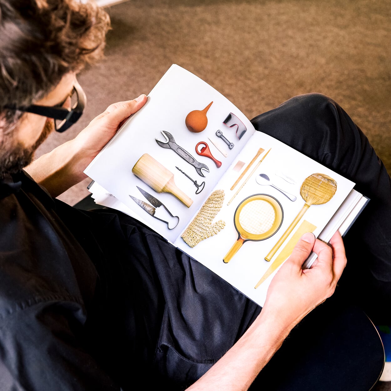
Incidentally, anyone browsing Dominik Lutz's shelves will quickly recognize where his design approach comes from. He names a triad as his main influences. His professor Lambert Rosenbusch is the most important of these - and also the designer whose philosophy speaks most clearly from 1HOCH3. "He opened up a completely different view of the world for me. It was important to him that you measure things, that you deal with architecture and the language of form. He then derived his own design from this." The second member of the team is Alfredo Häberli, with whom Lutz worked in 2001. Lutz appreciates his enthusiasm for form, his own handwriting and his work on precise hand drawings. Then there is Franco Clivio. Lutz enthusiastically leafs through his standard work "Hidden Design", a compendium of successful everyday design. Speaking of big names: Lutz initially had 1HOCH3 patented. When something is patented, a so-called search report is created in which references and comparable projects are listed. The one for 1HOCH3 included a shelf by Enzo Mari from 1967. The cross-reference to the great Italian designer naturally appealed to Dominik Lutz.
Dominik Lutz
Dominik Lutz was born in Stuttgart in 1974. He studied industrial design at the HfBK Hamburg and has been working as a freelance designer since 2002. In addition to 1HOCH3, he also designed TSCHUTSCHU, a piece of play furniture for children aged three and over, for MAGAZIN. In between, he teaches again and again, for example at the HfBK, the AMD Akademie Mode & Design Hamburg and the Zeppelin University Friedrichshafen
Pictures: Angela Simi
Shelving system 1hoch3
Discover more MAGAZIN products
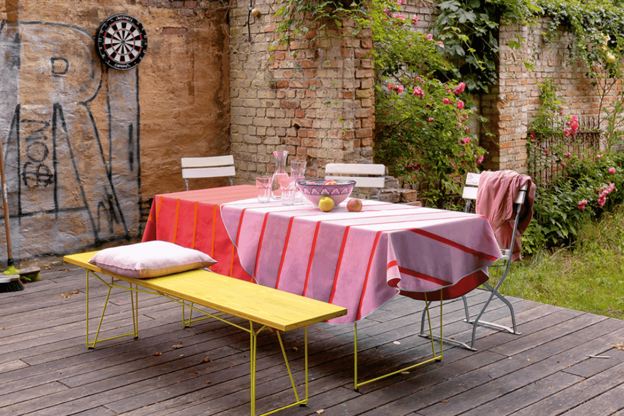
The young designer Julia Dichte has developed a contemporary table linen series for MAGAZIN. EQUIPE is produced by a French weaving mill.
When Kuno Nüssli's Container DS found its way into the MAGAZIN range, nobody would have dreamed that the product would one day become a bestseller. We visited the universal creative Kuno Nüssli in Basel.
With the EINSER, MAGAZIN has the first chair of its own in its range. The simple wooden model is manufactured in a young company in Slovenia, where the tradition of wooden furniture production goes back a long way.

