The great arch of Rennertshofen
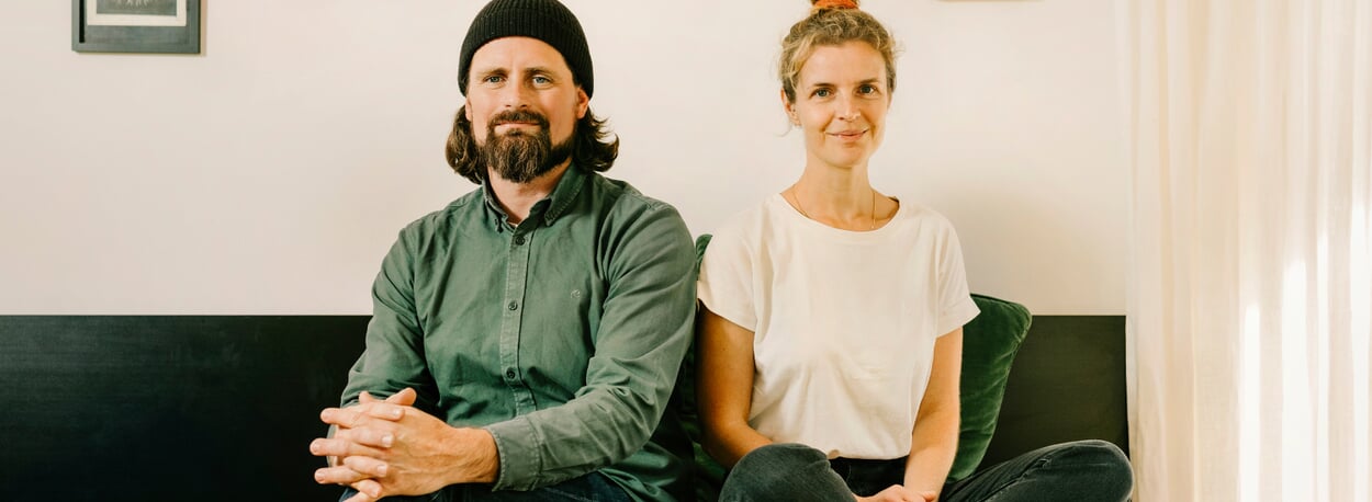
In Rennertshofen, a 20-minute drive from Neuburg an der Donau, which in turn is half an hour from Ingolstadt, you can live without the stress of the big city. Juliane Lanig and Moritz Schmidt also appreciate this: the couple designs products here that are holistic in the best sense of the word - including the MAGAZIN bed HANS.
Text: Jochen Overbeck
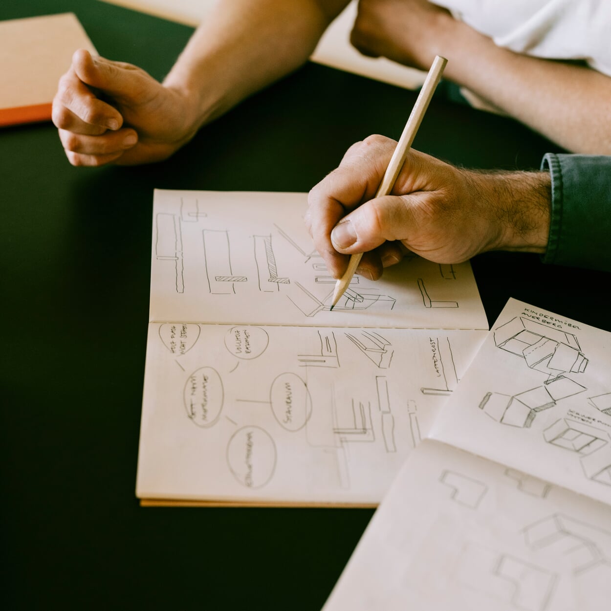
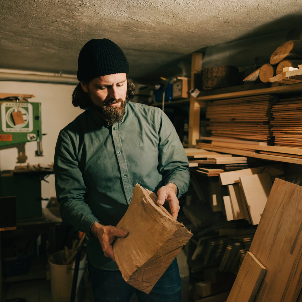
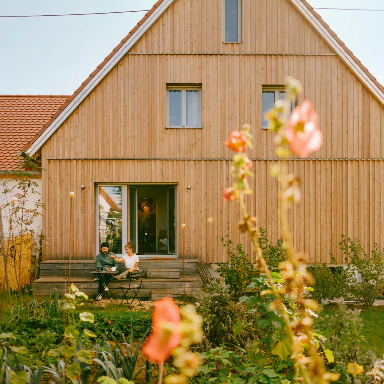
It's hard to say where it's most beautiful in this house: perhaps downstairs, in the basement. This is where the woodworking machines are, including the heavy lathe that was actually the reason why Moritz Schmidt and Juliane Lanig live here today with their three children: The two of them, then at home in Munich, actually only came because they were interested in this machine. Then they rented a place without further ado, only to realize after a year: it's really nice here! They bought the house. Perhaps the living room is also the most beautiful, where the view almost automatically falls into the garden. Or upstairs in the study, under the roof, where furniture designs and plenty of sketches show: People don't just design here. Here, people also think about what design actually is. The range is wide: there is the prototype of Schmidt's altar for the Protestant church in nearby Vohburg ("a wonderful task") next to the "blueprint", a DIY plan for multifunctional furniture: "We designed this for the 'Artaparat', a converted cigarette machine where you can buy art for four euros. You can take the plan to the DIY store, hand it in and have the panels cut to size," explains Schmidt.
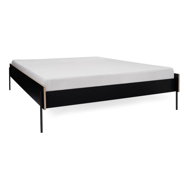
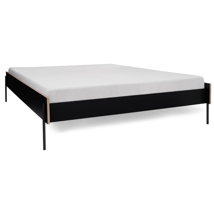
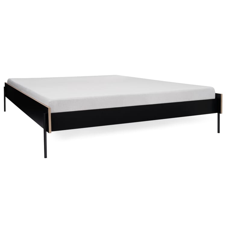
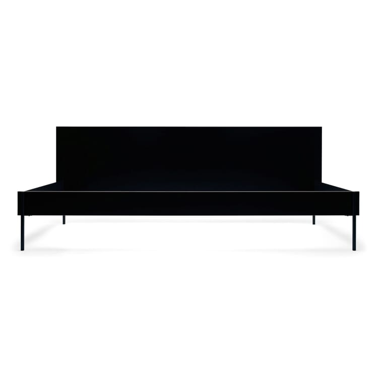
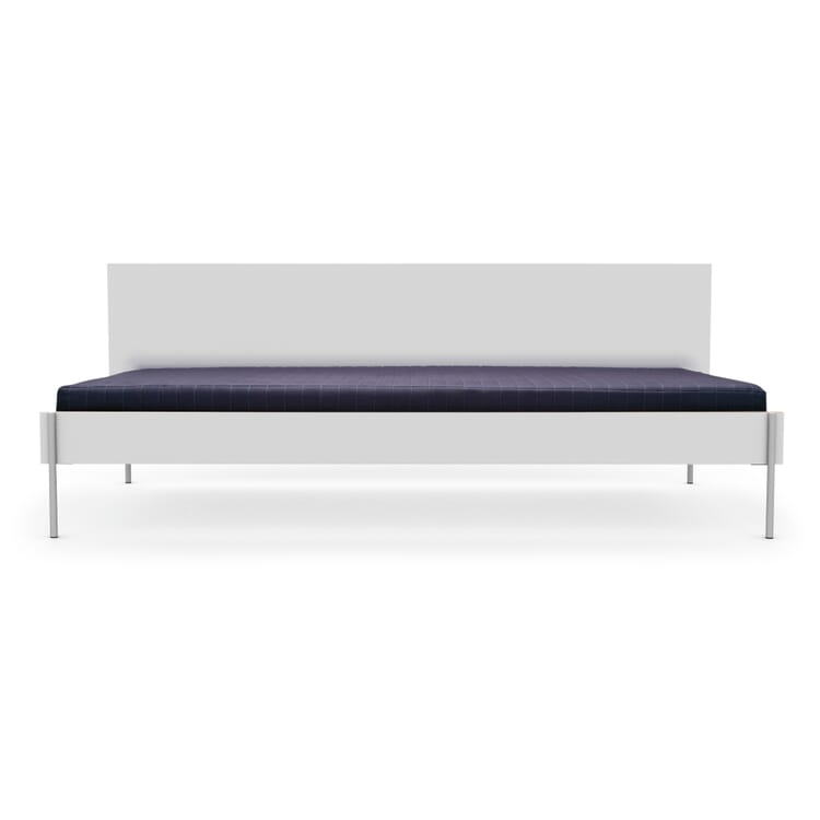
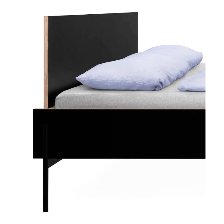
Of course, there is also a model of HANS, the bed that the two designed for MAGAZIN. HANS appears twice in the house as actual furniture. In the bedroom, the piece of furniture is part of a very lively family bed. As a daybed, it adorns the living room. It is interesting to note how different the two similar pieces of furniture appear. One tells a pragmatic story about everyday family life; the other: Well, it's not elegant. But the way it stands in the room, it shows off its design a little more confidently.
A bed - probably the biggest challenge for furniture designers alongside a chair and table. "It's a huge element in a room. It was a challenge to design a bed of this size in such a way that it never looks out of date and thus becomes a long-lasting product," says Lanig. "It was just as important to us that the bed also looks good when it is in use. It is so calm in itself that it can also be unmade from time to time," adds Schmidt. To achieve this, he and his partner focused a lot on the self-image of the furniture. "On the one hand, it has a simple appearance, while at the same time we play with the basic shapes and use different materials. It almost brings in something like irritation." The materials are coated plywood, sheet steel and tubular steel; in terms of form, surface meets cylinder. You can draw connections to the HfG Ulm, perhaps also to Wassily Kandinsky's Bauhaus primary forms of circle and square, but HANS actually speaks a very unique language. And it has a lot to do with its designers.
The two add a few footnotes to the idea of product design, which can be explained by their biographies. They both initially learned processing trades - and both later studied at the University of Design in Schwäbisch Gmünd; Moritz Schmidt product design and Juliane Lanig visual communication. In recent years, Lanig has worked a lot as a graphic designer: a fact that certainly has an impact on the couple's designs. Schmidt reflects: "Maybe it's also a matter of type, but Juliane's view of things is very different to mine. Clearer, more harmonious. For me, the basic idea is function first." Lanig adds: "On the other hand, I'm quite happy when something is already there. I always take a two-dimensional view of it. It's a kind of ping-pong."
Design ping-pong
Mind you, it's a game of ping-pong that the two of them play not against each other, but with each other, and which also involves another aspect: Both were already intensively involved with sustainability in design during their time at university. Schmidt came across the discipline of sustainable design during an exchange semester in Carlow in 2011; Lanig began researching the theses of the Club of Rome think tank in Schwäbisch Gmünd; they both wrote theses on the subject; Lanig is also intensively involved with permaculture, a concept of agriculture and horticulture in natural cycles. These ideas are part of an everyday life in which small and large ideas, concrete assignments and more distant considerations are intertwined. The "blueprint" mentioned at the beginning is one such case. What initially appears to be a small gimmick, along the lines of Enzo Mari's "Autoprogettazione" designs from 1974 or Van Bo Le-Mentzel's more recent "Hartz-IV furniture", has a second level: the two want to add an ecological component to the DIY principle. "How can we turn existing materials into serious series products that don't have this recycled character? That really appeals to us."
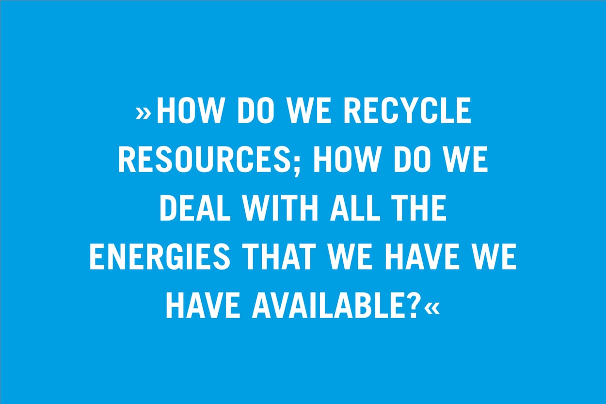
Urban mining is a term that Schmidt likes to use. But the term permaculture also applies when it comes to their work. One of their latest products shows how this works on a small scale: a fruit bowl made of spruce wood, which is created from offcuts from a carpentry workshop. It sits beautifully in the hand and radiates an immense sense of calm. But a tour of their home also makes it clear that the concept of design is not limited to creating products and then pitching them to manufacturers. Rather, pragmatism meets efforts to achieve the greatest possible sustainability. The central questions here are the same on a small scale as on a large scale: "How do we recycle resources; how do we deal with all the energy we have available?" explains Schmidt.
The garden as a design laboratory
Much is and has been redone, but always with a sense of proportion. The kitchen sink, for example, was already in service with the previous owners and was still in perfect working order; Schmidt integrated it into his new kitchen design. The tiles in the kitchen and bathroom were also allowed to stay, partly because of some of the details. "See the rounded edges on the top row of tiles? Nobody does it like that anymore. Now they put these stainless steel strips on them because it's 'cleaner'." But above all, you notice that design is always best when it arises from a need. And: design is always related to what already exists. There is the high table in the living room, for example, which looks a bit like a counter, but at the same time fits in perfectly with the bookshelves by Schmidt's former employer Nils Holger Moormann, which characterize the room. "We built it for my 40th birthday," says Schmidt. "But it's actually quite practical, we now also use it for meetings." The wrought-iron banister leading to the upper floor had a concealed run. When the plastic coating was removed, a bright orange protective coating was revealed. They liked it so much that they allowed it to stay. A large panoramic window looks out onto the garden, which also serves as a seating area: "The garden is important to us. It is a place of retreat. But it also grounds us and helps us to be self-sufficient," says Lanig.
It's true, this garden really is grounding. And it is also something of a design laboratory; the responsible use of resources that runs through both biographies perhaps reaches its peak here. An old washing machine drum was buried in front of the house; it is a mini vegetable cellar. The old roof tiles, which the construction company actually wanted to shred, have also found a new purpose: They have become a border for a new large bed, perkily blinking out of the ground on the slope of the terrace. "We find the texture really exciting," explains Juliane Lanig: "But at the same time, these bricks also have a use: They heat up in the sun and therefore also the soil behind them. Another ulterior motive is that it also provides a habitat for insects." Next up will be a few chickens, then we'll have our own eggs. Let someone else say there's nothing going on in Rennertshofen.
Lanig & Schmidt
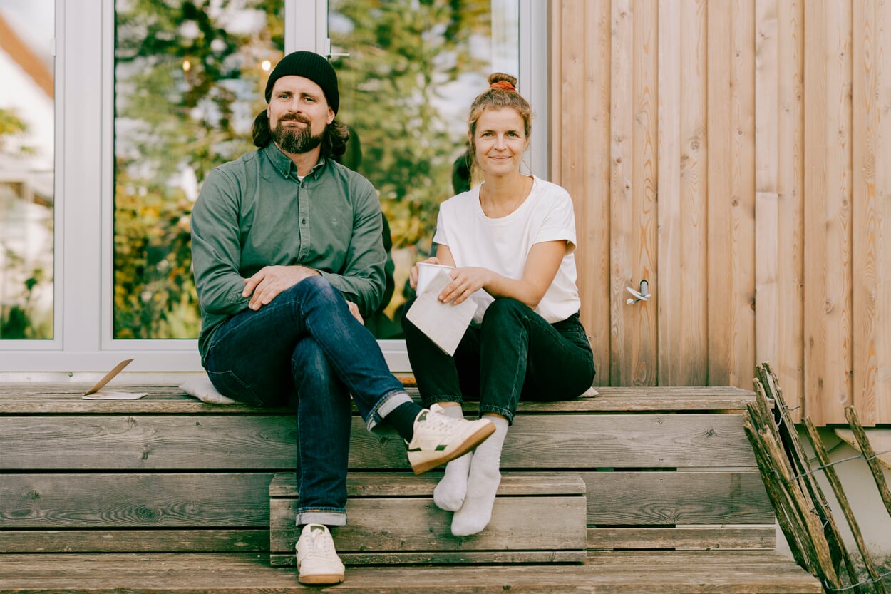
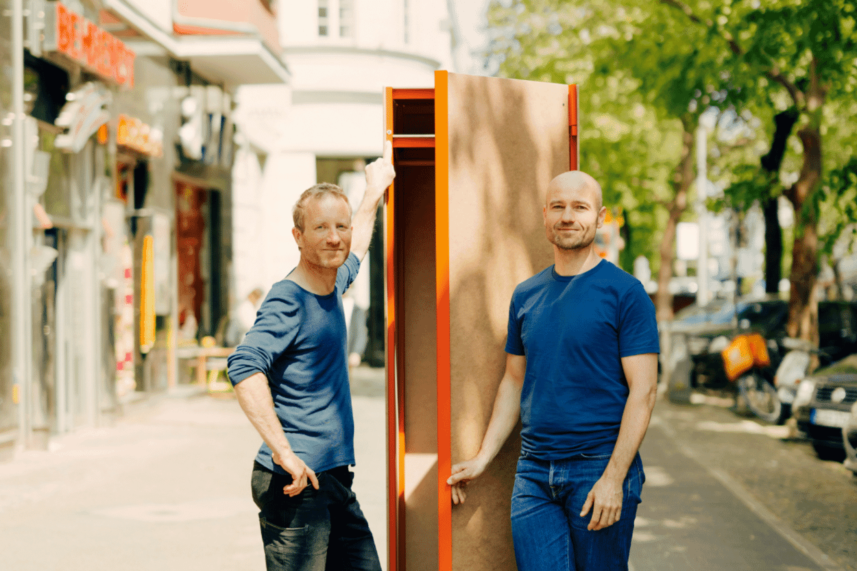
Moritz Schmidt and Juliane Lanig met in 2009 while studying at the University of Design Schwäbisch Gmünd and now live with their family in Rennertshofen in Upper Bavaria. The two have been working together on various projects since 2013, with their credo being the combination of design and sustainability. They designed the HANS bed and daybed for Magazin.
6 questions for Lanig & Schmidt
Where would you like to travel one day?
What is your favorite tool?
What could you easily do without?
Which superpower would you like to have?
Do you collect anything?
What have you always wanted to do?
Images: Lena Giovanazzi Illustartions: Juliane Lanig and Moritz Schmidt
Bed and Daybed Hans
Discover more MAGAZIN products
Space-consuming and conventional - that's how we know the closet. But there is another way, as MAGAZIN shows with the new MAGAZIN product P100: The wardrobe is based on a steel construction that is clad with panels made from a new, sustainable wood-based material.
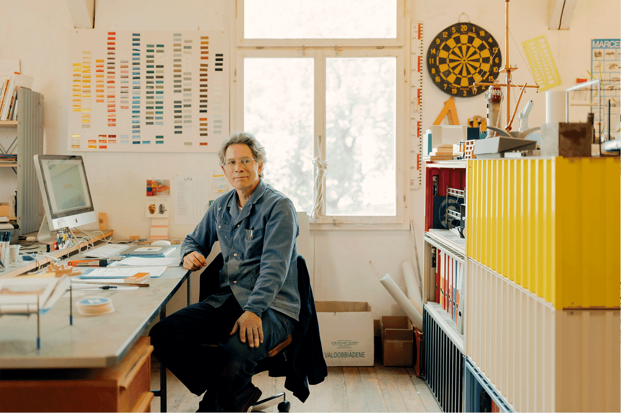
When Kuno Nüssli's Container DS found its way into the MAGAZIN range, nobody would have dreamed that the product would one day become a bestseller. We visited the universal creative Kuno Nüssli in Basel.
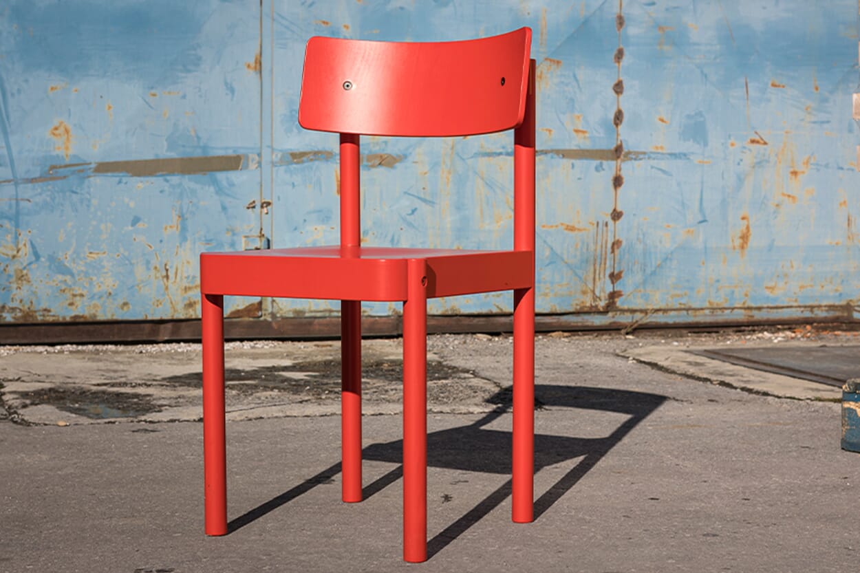
With the EINSER, MAGAZIN has the first chair of its own in its range. The simple wooden model is manufactured in a young company in Slovenia, where the tradition of wooden furniture production goes back a long way.

